A New Look for Wurdi Baierr: Honouring Community, Culture and Connection
Wurdi Baierr and Winchelsea Pool are in an exciting period of change as we evolve to meet the needs of the growing Surf Coast shire community. As part of the upcoming transformation, we are thrilled to unveil our new aquatic and recreation branding designed by artist Gerald Black, a proud Worimi man who grew up on Wadawurrung Country.
Wurdi Baierr is a Wadawurrung term meaning ‘big gathering place’. The new logo, name and brand were designed to reflect our intention of bringing people together and developing communities within our facilities.
The Meaning Behind our Logo
The Wurdi Baierr logo was created by artist Gerard Black to reflect the centre’s goal of being a gathering place for all people. Gerald Black is a proud Worimi man who grew up on Wadawurrung Country in Torquay and uses his love of nature as the basis of his work.
When developing our new brand, the Wadawurrung Traditional Owners Aboriginal Corporation suggested a sand-based logo, honouring the beach’s traditional role as a ‘multi-function place, like this new facility will be.’
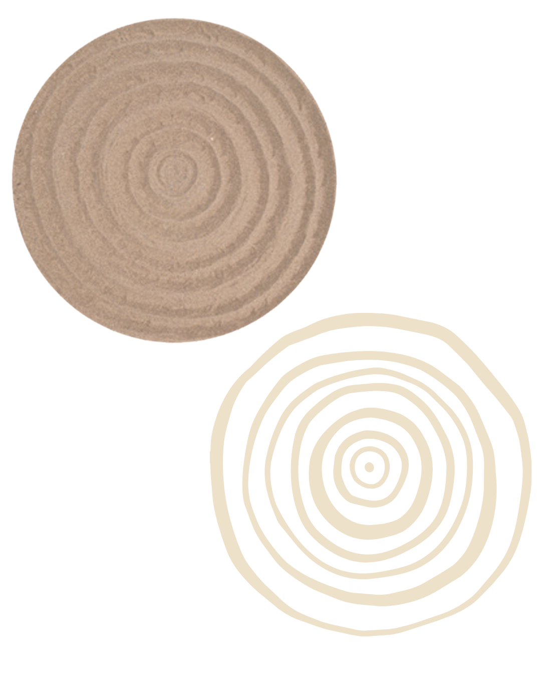
Gerard Black took inspiration from this and developed the logo by using his feet to draw in the sand at Djarrak (Bells Beach). He then photographed it with a drone and created a 3D rendered and 2D illustration of it. This method reflects Black’s artistic intention of viewing the world from the perspective of Baiyami, the Sky Father from Dreaming Tradition. This logo will be shared by Wurdi Baierr Aquatic and Recreation Centre and the Winchelsea Pool to show that both venues are connected in their mission to represent the Surf Coast and its community.
Reflecting the Community and Landscape
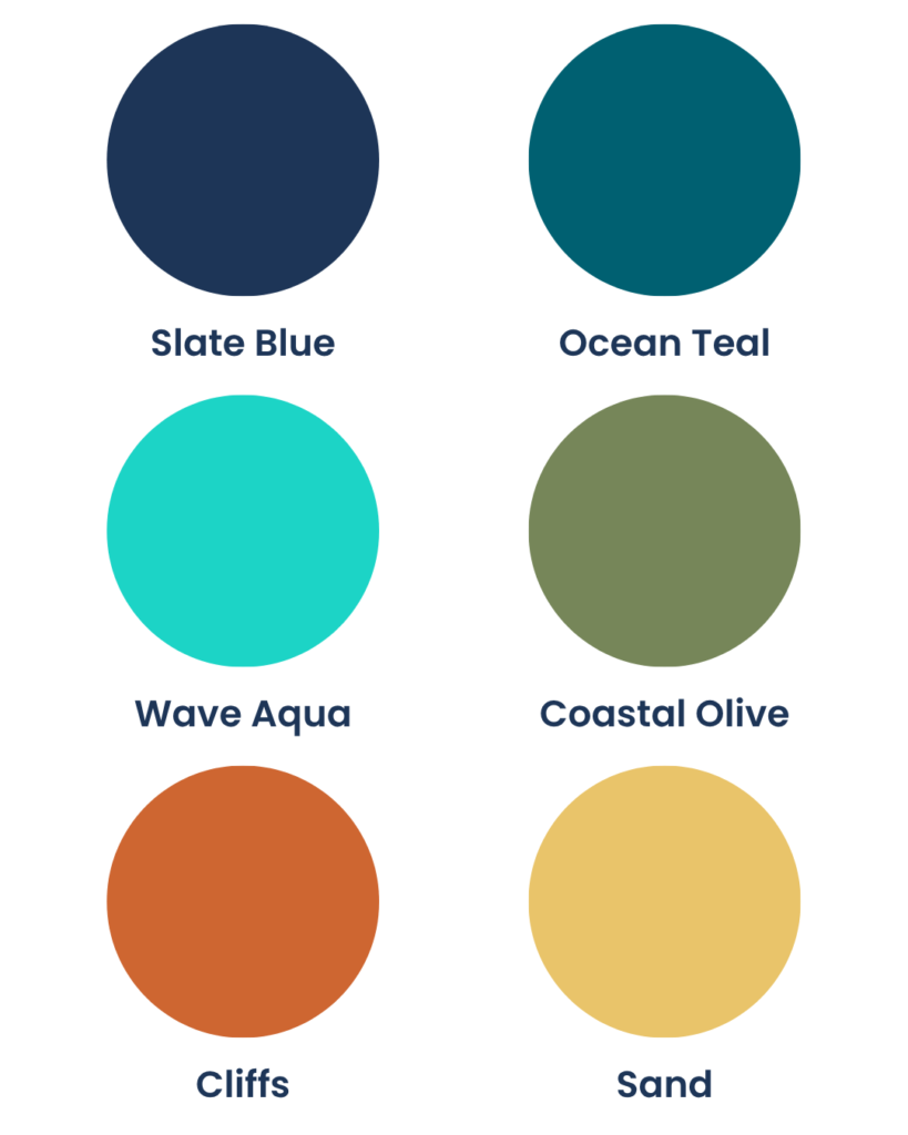
Our new look includes a selection of different colours to represent the local landscape of the Surf Coast shire. As Wurdi Baierr Stadium prepares to expand into Wurdi Baierr Aquatic and Recreation Centre, our refreshed brand incorporates the calming colours of water and the ocean. The three blues were selected to create a clean, relaxed feeling reminiscent of the nearby beaches. The sand yellow and olive green add to the organic and fresh appearance whilst the stronger orange adds a bolder sense of strength and reflects the iconic surf coast cliffs.
Our refreshed branding represents more than just a new look. It reflects our commitment to creating welcoming spaces where people can connect, get active and thrive. Inspired by the landscapes and communities of the Surf Coast, the new brand honours both our local environment and the enduring cultural significance of this place. As we get ready for the opening of Wurdi Baierr Aquatic and Recreation Centre and the future of Winchelsea Pool, this shared identity will unite our venues under a common vision: supporting the health, wellbeing and connection of our community for generations to come.